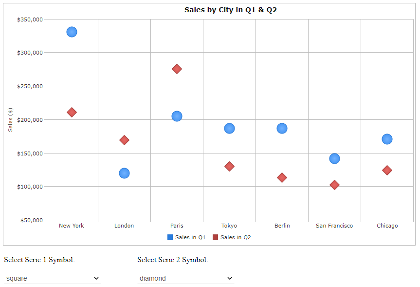
The scatter chart can be used to display the values of two variables using their x and y coordinates. The values are presented on the chart as a collection of points. Our chart enables the presentation of more than one series where the values of each series are presented with a different symbol.
Angular Scatter Chart Features
The shapes of the symbols representing the variables can be circle, diamond, square, triangle_up, triangle_down, triangle_left and triangle_right.

The colors of the shapes can be changed.
When you point to a shape on the chart a label appears giving you the values of the respective variable.
The captions on the x and y axis can be horizontal or vertical.
You can see an example here.