Grid Column Chooser
With the next release, we will deliver a new feature for our Grid component, called – Column Chooser.
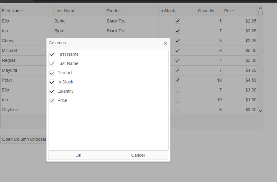
To open it, we added a method called: “openColumnChooser” and that is all you need to do in order to open it. That dialog allows you to customize the visibility of your Grid columns. They will be displayed in a dialog window and each column will be presented by a checkbox item. Checked means that the column is visible, unchecked that it will be hidden.
The next release is scheduled for 10-April.