Angular Grid UI Component
jQWidgets Angular Grid is an advanced data grid user interface component built on top of Typescript, Angular and the jQWidgets framework. It is feature complete and is built by the same developers who implemented the best Javascript Grid – jqxGrid. With our Angular Grid, you can use the same API and functionalities.
GREAT PERFORMANCE
jqxGrid offers fast data updates on all end-user features such as grouping, sorting, paging, and scrolling. The Angular Grid also comes with row and column virtualization, which minimizes the amount of items that need to be rendered, and ensures unbeatable performance in spread-like scenarios with thousands of rows and columns.
UNIQUE FLEXIBILITY
jqxGrid is developed on top of the jQWidgets UI Framework and delivers a combination of unique features which can be easily enabled, disabled or customized. Our Angular Grid provides the ultimate flexibility over your data and its presentations including paging, grouping and sorting.
SORTING
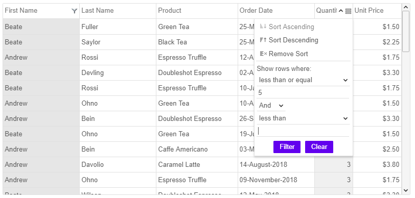
The Angular Grid supports built-in powerful sorting capabilities like one-click automatic sorting, selection of sort option from a context menu, and sorting through APIs. The data grid automatically chooses the most appropriate comparison. Users can also implement and use a custom sort comparer. The sorting works well with all possible configurations including rows grouping and paging. Angular Grid also has an option to display an additional background in the sorted column.
Some of the other supported features by our Angular Grid are: Filtering, Paging, Grouping, Nested Grids, Pinned(Frozen) Columns, Conditional Formatting, Cells Editing, Row Editing, Data Validation and many more.
Lets start with a simple Angular Grid setup:
Template:
<jqxgrid [width]="500" [source]="dataAdapter" [columns]="columns"> </jqxgrid>
Component:
export class AppComponent { //This generates some random array with data data: any[] = generatedata(100); source: any = { localdata: this.data, datafields: [ { name: 'firstname', type: 'string' }, { name: 'lastname', type: 'string' }, { name: 'price', type: 'number' } ], datatype: 'array' }; dataAdapter: any = new $.jqx.dataAdapter(this.source); columns: any[] = [ { text: 'First Name', datafield: 'firstname', width: 200 }, { text: 'Last Name', datafield: 'lastname', width: 200 }, { text: 'Unit Price', datafield: 'price', cellsalign: 'right', cellsformat: 'c2' } ]; }
As you can see we can either directly assign value to the property like with the width or we can use a property from our component class – source & columns.
And here is the result:

Now let’s add some features to the Angular Grid:
<jqxgrid [width]="500" [source]="dataAdapter" [columns]="columns" [pageable]="true" [editable]="true" [filterable]="true" [autoheight]="true"> </jqxgrid>
The code in AppComponent stays the same(as above Component example), because we don’t have anything new we need from there.
Paging Feature:
jQWidgets Angular Grid has integrated paging functionality that lets the users to view large data sets in multiple pages for faster loading and intuitive navigation. Users also have an option to select how many records they would like to see on a page by using a page-size dropdown. To navigate to a page, users can enter the page number in the page-input box and click the ‘enter’ key or they can click the ‘next’ and ‘previous’ navigation buttons to navigate to the next or the previous page.
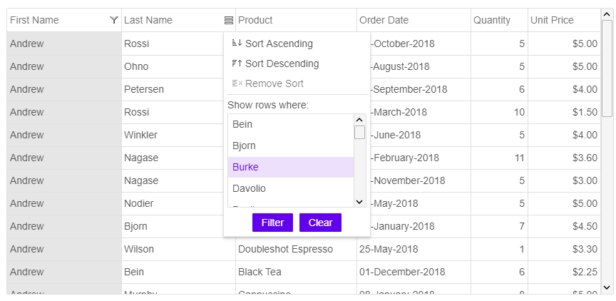
Filtering Feature:

Every event you have in the normal jqxGrid is available in Angular Grid too. All you need to do is write on before it and upperCase it’s first letter.
You bind it like this:
<jqxgrid (onCellbeginedit)="cellBeginEditEvent($event)" [width]="500" [source]="dataAdapter" [columns]="columns"></jqxgrid>
The Angular Grid by jQWidgets is fast and easy to use. It works across devices and has a consistent look and behavior on PCs, tablets and mobile phones. It is a perfect solution for complex Angular UI applications.
Browser our Grid demos: https://www.jqwidgets.com/angular/angular-grid/