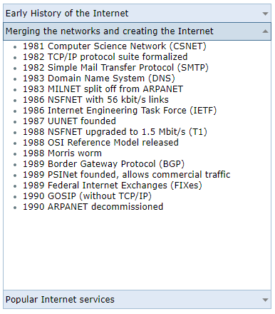
The Accordion is a list of expandable items. It contains a header section which resembles a Tab and a content section which includes the list of items. The main difference between the Accordion and the Navigation Bar is that the Accordion can have only one expanded item at a time.
React Accordion functionality
The Accordion is actually the default state of our React Navigation Bar component.

It can be read only or disabled by setting the disabled property to true.
The accordion supports toggle mode. This is useful when you want to put accent on the currently selected tab of the accordion.
You can customize the text and background colors.
Keyboard navigation, right to left order and fluid design are also supported.
You can see an example here.