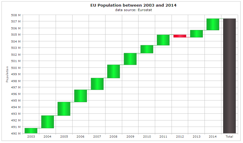
The Angular Waterfall chart is used to show the cumulative effect of a measured variable. It is a two dimensional chart where usually time is set on the x axis and the measured data is set on the y axis. In the example below you can see how to use the waterfall chart to display the growth of the population in the EU.
Angular Waterfall chart features
You can set the color of the measured variable. Different colors can be set for positive and negative cumulative effects. You can also put a different color for the total.
The Waterfall series also supports labels. This makes possible to see the measured value in a rectangular field when you put the mouse over it.
The shape of the objects representing the measured data can be changed.
The chart also supports animation. This makes possible to visualize the current measured variable in a different shade when the mouse is over it.
The labels can be put horizontally or vertically on the axes.
You can see an example here.