- Demo
- App.htm
- App.Component.ts
- App.Component.htm
- App.Module.ts
Angular 20 Tree
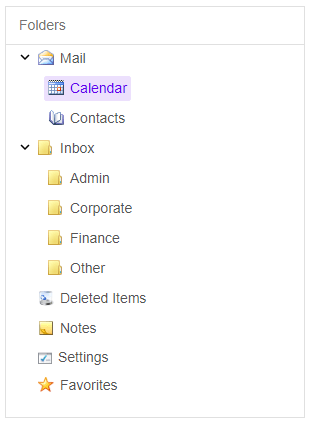
The Tree component is used to show hierarchical information which starts from the root item and proceed to its children and their respective children. Each item besides the root has a parent and can have children. The parent is the node which is higher in the hierarchy and the child the one that is lower. Siblings are items which have one and the same parent. Items can be expanded and collapsed.

Angular Tree Features
Images and Navigation. You can display images and textboxes next to the items as well as use different types of Navigation.
Context Menus. Context Menus can be used to add or remove items from the Angular. In this case you have to press the right click when you are positioned on the item and a context menu will open.
CheckBoxes. You can position checkboxes next to the items. Three state checkboxes can also be enabled. In this mode when the user clicks an item its children or sub items also become checked. If there is an unchecked node the parent item is in indeterminate state.
Popup and Drop Down Tree. You can display the Tree component in a Popup and thus create a drop down tree.
Colors and Themes. You can change to text and background colors and the predefine themes which include 3 Angular Material Themes.
In addition the Tree component supports also keyboard navigation, drag and drop, and right-to-left layout. It can also be built or loaded from JSON data or from XML data.
Native Angular Features
Declarative configuration, AOT compilation, TypeScript compile-time validation, Material Design themes and more.
