
Angular UI Components
Show Demo List
|
|
|
|
The MaskedInput for Angular resembles an ordinary input component where in addition you can define a model and a mask which makes it very convenient if you wish to enter phone numbers, zip code, social security numbers, etc.
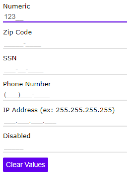
jqxMaskedInput is the jQWidgets MaskedInput component for Angular. Input that restricts typing to a mask such as phone numbers, zip codes or IDs.
jqxMaskedInput has 10 properties, 2 events and 4 methods, all in the API reference. Its main members, those its demos use first:
mask (property) – Sets or gets the masked input's mask.clear (method) – Clears the value.value (property) – Sets or gets the masked input's value.change (event) – This event is triggered when the value is changed and the control's focus is lost.valueChanged (event) – This event is triggered when the value is changed.promptChar (property) – Sets or gets the prompt char displayed when an editable char is empty.readOnly (property) – Sets or gets the readOnly state of the input.textAlign (property) – Sets or gets the text alignment.destroy (method) – Destroys the widget.focus (method) – Focuses the widget.