
Angular UI Components
Show Demo List
|
|
|
|
The Popover for Angular displays a popup with custom HTML over other HTML Elements on the web page. It is displayed as a static popup which can be modal or not.
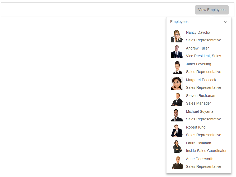
jqxPopover is the jQWidgets Popover component for Angular. Popover anchored to an element, with a title, arrow and any content.
jqxPopover has 17 properties, 2 events and 1 method, all in the API reference. Its main members, those its demos use first:
arrowOffsetValue (property) – Sets or gets the arrow's offset from its default position.offset (property) – Sets or gets the Popover's offset from its position.selector (property) – Sets or gets the Popover's selector.showCloseButton (property) – Sets or gets whether the close button is displayed.title (property) – Sets or gets the popover's title.position (property) – Sets or gets the position of the popover.isModal (property) – Sets or gets whether the popover is displayed as a modal dialog.animationOpenDelay (property) – The time for showing of the widget.animationCloseDelay (property) – The time for showing of the widget.autoClose (property) – Sets or gets the closing of the widget after click outside of the popover.