
jQWidgets
  • Docs
  • License and Pricing
  • Services
  • Community
    • Forums
    • Blogs
    • Follow Us
    • Client Login
  • About
    • About Us
    • Contact Us
    • FAQ
  • Products
    • Angular
    • React
    • Vue
    • jQuery
    • Web Components
    • Blazor
    • Svelte
    • Templates
  • Download
Angular UI Components
  • Javascript/jQuery
  • Angular
  • Vue
  • React
  • Web Components
  • Blazor
  • Templates
  • Theme Builder
  • Artavolo
Show Demo List

Angular UI Components (Angular 16–22 supported)

Data Grids and Tables

  • jqxGrid
  • jqxPivotGrid
  • jqxTreeGrid
  • jqxDataTable

Charts and Visualization

  • jqxChart
  • jqxGauge
  • jqxBarGauge
  • jqxBulletChart
  • jqxHeatMap
  • jqxTreeMap
  • jqxRangeSelector
  • jqxBarcode New
  • jqxQRcode New
  • jqxDraw

Scheduling and Planning

  • jqxScheduler
  • jqxGantt
  • jqxKanban
  • jqxTimeline

AI and Collaboration

  • jqxChat New

Editors and Inputs

  • jqxEditor
  • jqxForm
  • jqxDateTimeInput
  • jqxCalendar
  • jqxTimePicker
  • jqxInput
  • jqxNumberInput
  • jqxMaskedInput
  • jqxFormattedInput
  • jqxComplexInput
  • jqxPasswordInput
  • jqxTextArea
  • jqxColorPicker
  • jqxSlider
  • jqxKnob
  • jqxRating
  • jqxButtons
  • jqxCheckBoxGroup New
  • jqxFileUpload
  • jqxValidator
  • jqxValidator

Lists and Selection

  • jqxDropDownList
  • jqxComboBox
  • jqxListBox
  • jqxTree
  • jqxPickList New

Navigation and Menus

  • jqxTabs
  • jqxMenu
  • jqxToolBar
  • jqxRibbon
  • jqxNavigationBar
  • jqxNavBar
  • jqxListMenu

Layout and Containers

  • jqxSplitter
  • jqxLayout
  • jqxDockingLayout
  • jqxDocking
  • jqxSplitLayout
  • jqxPanel
  • jqxExpander
  • jqxResponsivePanel
  • jqxScrollView
  • jqxScrollBar

Popups and Feedback

  • jqxWindow
  • jqxNotification
  • jqxTooltip
  • jqxPopOver
  • jqxLoader
  • jqxProgressBar

Data and Utilities

  • jqxDragDrop
  • jqxSortable

jqxListBox

  • Default Functionality
  • Text with Icons
  • Categories
  • Multiple Selection
  • Selection with Shift & Ctrl
  • Binding to Array
  • Binding to XML
  • Binding to JSON Data
  • Items Reorder
  • Drag & Drop
  • Custom Rendering
  • CheckBoxes
  • Filtering
  • Load Data from Select
  • Fluid Size
  • Events
  • Keyboard Navigation
  • Right to Left Layout
Theme:
  • Demo
  • App.htm
  • app.ts
  • app.html
  • main.ts
  • API Reference

Angular ListBox UI Component

The ListBox for Angular represent a component which contains a list of selectable items. It supports external data and can contain checkboxes next to the items. In addition the ListBox can display the items in groups by using the item's group property. Filtering and right to left layout can be applied. The component enables single and multiple selection and initialization from DIV, SELECT, UL or OL. It supports full UI virtualization which minimizes the number of DOM elements that need to be rendered and improves performance in scenarios with thousands of list items.
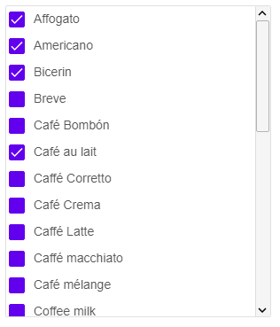
angular listbox

About jqxListBox for Angular

jqxListBox is the jQWidgets ListBox component for Angular. List with single or multiple selection, check boxes, grouping, filtering and drag-and-drop.

18 jqxListBox demos with source code

  • Default Functionality – The default functionalities in Angular ListBox.
  • Text with Icons – Images next to the text in Angular ListBox.
  • Categories – Display items in groups in Angular ListBox.
  • Multiple Selection – Angular ListBox's multiple selection function.
  • Selection with Shift & Ctrl – Shift and Ctrl in Angular ListBox.
  • Binding to Array – Angular ListBox's binding to an Array.
  • Binding to XML – Angular ListBox's binding to XML.
  • Binding to JSON Data – Angular ListBox's binding to a JSON data.
  • Items Reorder – Reordering in Angular ListBox.
  • Drag & Drop – The drag and drop function in Angular ListBox.
  • Custom Rendering – Angular ListBox's custom rendering function.
  • CheckBoxes – Display checkboxes next to the items in Angular ListBox.
  • Filtering – The filtering in Angular ListBox.
  • Load Data from Select – Angular ListBox's data that was selected from another existing element.
  • Fluid Size – The width and height of Angular ListBox are set in percentages.
  • Events – The events that occur in Angular ListBox.
  • Keyboard Navigation – Keyboard navigation in Angular ListBox.
  • Right to Left Layout – Angular ListBox's right to left support.

jqxListBox API

jqxListBox has 34 properties, 5 events and 42 methods, all in the API reference. Its main members, those its demos use first:

  • select (event) – This event is triggered when the user selects an item.
  • selectedIndex (property) – Sets or gets the selected index.
  • displayMember (property) – Sets or gets the displayMember of the Items.
  • valueMember (property) – Sets or gets the valueMember of the Items.
  • renderer (property) – Callback function which is called when an item is rendered.
  • change (event) – This event is triggered when the user selects an item.
  • getSelectedItems (method) – Gets the selected ListBox items.
  • selectIndex (method) – Selects item.
  • multipleextended (property) – Enables/disables the multiple selection using Shift and Ctrl keys.
  • focus (method) – Sets the focus to the jqxListBox.

Learn more

  • Getting started
  • API reference
  • JavaScript version
jQWidgets
  • Facebook
  • X (Twitter)
  • Demo
  • Download
  • Documentation
  • License and Pricing
  • Services
  • Products
  • Angular UI Components
  • React UI Components
  • Vue UI Components
  • Blazor UI Components
  • jQuery UI Components
  • Javascript UI Components
  • Svelte Data Grid (SvGrid)
  • Forums
  • About
  • Terms of Use
  • Privacy Policy
  • Contact Us

jQWidgets © 2011-2026. All Rights Reserved.