
jQWidgets
  • Docs
  • License and Pricing
  • Services
  • Community
    • Forums
    • Blogs
    • Follow Us
    • Client Login
  • About
    • About Us
    • Contact Us
    • FAQ
  • Products
    • Angular
    • React
    • Vue
    • jQuery
    • Web Components
    • Blazor
    • Svelte
    • Templates
  • Download
Angular UI Components
  • Javascript/jQuery
  • Angular
  • Vue
  • React
  • Web Components
  • Blazor
  • Templates
  • Theme Builder
  • Artavolo
Show Demo List

Angular UI Components (Angular 16–22 supported)

Data Grids and Tables

  • jqxGrid
  • jqxPivotGrid
  • jqxTreeGrid
  • jqxDataTable

Charts and Visualization

  • jqxChart
  • jqxGauge
  • jqxBarGauge
  • jqxBulletChart
  • jqxHeatMap
  • jqxTreeMap
  • jqxRangeSelector
  • jqxBarcode New
  • jqxQRcode New
  • jqxDraw

Scheduling and Planning

  • jqxScheduler
  • jqxGantt
  • jqxKanban
  • jqxTimeline

AI and Collaboration

  • jqxChat New

Editors and Inputs

  • jqxEditor
  • jqxForm
  • jqxDateTimeInput
  • jqxCalendar
  • jqxTimePicker
  • jqxInput
  • jqxNumberInput
  • jqxMaskedInput
  • jqxFormattedInput
  • jqxComplexInput
  • jqxPasswordInput
  • jqxTextArea
  • jqxColorPicker
  • jqxSlider
  • jqxKnob
  • jqxRating
  • jqxButtons
  • jqxCheckBoxGroup New
  • jqxFileUpload
  • jqxValidator
  • jqxValidator

Lists and Selection

  • jqxDropDownList
  • jqxComboBox
  • jqxListBox
  • jqxTree
  • jqxPickList New

Navigation and Menus

  • jqxTabs
  • jqxMenu
  • jqxToolBar
  • jqxRibbon
  • jqxNavigationBar
  • jqxNavBar
  • jqxListMenu

Layout and Containers

  • jqxSplitter
  • jqxLayout
  • jqxDockingLayout
  • jqxDocking
  • jqxSplitLayout
  • jqxPanel
  • jqxExpander
  • jqxResponsivePanel
  • jqxScrollView
  • jqxScrollBar

Popups and Feedback

  • jqxWindow
  • jqxNotification
  • jqxTooltip
  • jqxPopOver
  • jqxLoader
  • jqxProgressBar

Data and Utilities

  • jqxDragDrop
  • jqxSortable

jqxLoader

  • Default Functionality
  • Show only Icon
  • Show only Text
  • Show Modal Loader
  • Right to Left Layout
Theme:
  • Demo
  • App.htm
  • app.ts
  • app.html
  • main.ts
  • API Reference

Angular Loader UI Component

The Loader for Angular displays a loading image indicating that some process is happening.
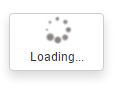
angular loader

About jqxLoader for Angular

jqxLoader is the jQWidgets Loader component for Angular. Loading indicator overlay with text and images.

5 jqxLoader demos with source code

  • Default Functionality – Angular Loader's default functionalities.
  • Show only Icon – The Show only Icon demo of the Angular Loader.
  • Show only Text – The Show only Text demo of the Angular Loader.
  • Show Modal Loader – A modal dialog in Angular Loader.
  • Right to Left Layout – Angular Loader's support of right to left orientation.

jqxLoader API

jqxLoader has 10 properties, 0 events and 2 methods, all in the API reference. Its main members, those its demos use first:

  • open (method) – Opening/showing the current loader.
  • close (method) – Closing the current loader.
  • imagePosition (property) – Sets or gets the image's position.
  • text (property) – Sets or gets the loader's text.
  • html (property) – Sets the loader's content.
  • isModal (property) – Sets or gets whether the loader is displayed as a modal dialog.
  • autoOpen (property) – Sets or gets whether the loader will be shown after it's creation.
  • textPosition (property) – Sets or gets the alignment.

Learn more

  • Getting started
  • API reference
  • JavaScript version
jQWidgets
  • Facebook
  • X (Twitter)
  • Demo
  • Download
  • Documentation
  • License and Pricing
  • Services
  • Products
  • Angular UI Components
  • React UI Components
  • Vue UI Components
  • Blazor UI Components
  • jQuery UI Components
  • Javascript UI Components
  • Svelte Data Grid (SvGrid)
  • Forums
  • About
  • Terms of Use
  • Privacy Policy
  • Contact Us

jQWidgets © 2011-2026. All Rights Reserved.