
Angular UI Components
Show Demo List
|
|
|
|
The Splitter component for Angular provides an easy way to create dynamic layouts allowing you to resize and collapse panels. These panels actually are HTML container's children. You can create both horizontal and vertical splitters based on your needs. The component enables complex layouts with nesting multiple splitters. The Splitter can be integrated with the other components of the JQWidgets framework including Tabs, Tree and Grid.
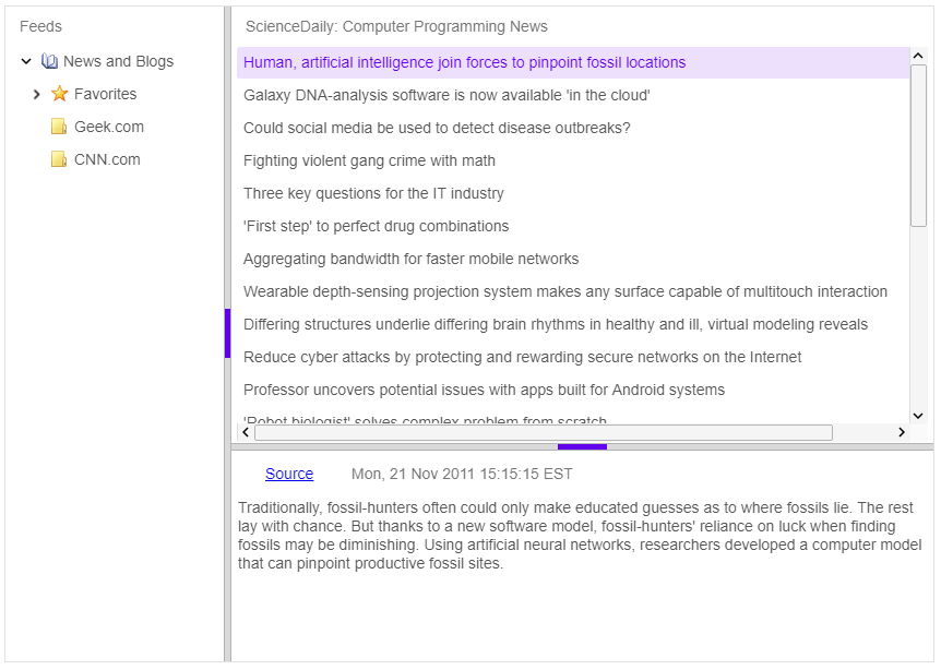
jqxSplitter is the jQWidgets Splitter component for Angular. Resizable, collapsible panels split horizontally or vertically.
jqxSplitter has 9 properties, 4 events and 7 methods, all in the API reference. Its main members, those its demos use first:
panels (property) – Sets or gets the panels property.orientation (property) – Sets or gets the orientation property.expanded (event) – This event is triggered when a panel is expanded.refresh (method) – Refreshes the jqxSplitter.collapse (method) – Collapse a panel.disable (method) – Disables the jqxSplitter.enable (method) – Enables the jqxSplitter.expand (method) – Expands a panel.collapsed (event) – This event is triggered when a panel is collapsed.resize (event) – This event is triggered when the 'resize' operation has ended.