
Angular UI Components
Show Demo List
|
|
|
|
The Password Input for Angular displays an input field for entering password. The component has options to display password strength indications, to reveal the password by clicking an icon and other features.
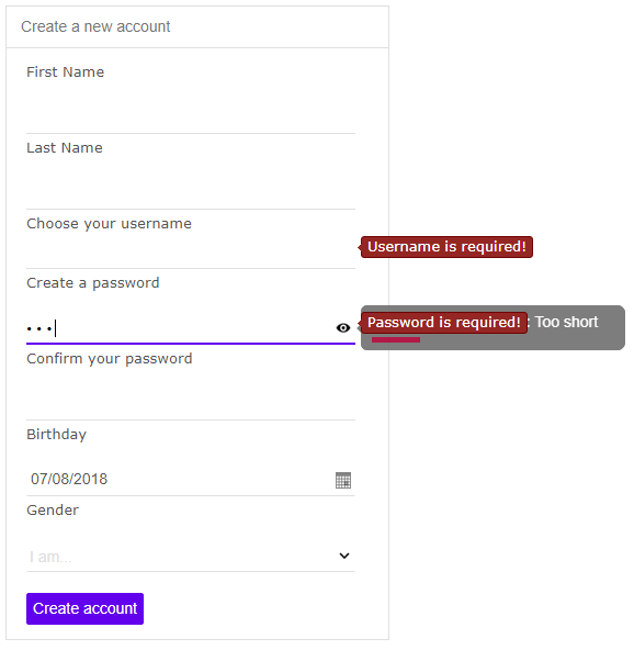
jqxPasswordInput is the jQWidgets PasswordInput component for Angular. Password input with a show-password toggle and a strength indicator.
jqxPasswordInput has 14 properties, 1 event and 3 methods, all in the API reference. Its main members, those its demos use first:
placeHolder (property) – Gets or sets the password input's placeholder text.showStrength (property) – Gets or sets whether a tooltip which shows the password's strength will be shown.val (method) – Gets or sets the password.passwordStrength (property) – A callback function for defining a custom strength rule.showStrengthPosition (property) – Gets or sets the position of the tooltip which shows the password strength.localization (property) – Sets the various text values used in the widget.maxLength (property) – Gets or sets the maximal number of characters in the password.strengthColors (property) – Sets the the colors used in the tooltip which shows the strength.strengthTypeRenderer (property) – A callback function for custom rendering of the tooltip which shows the password strength.showPasswordIcon (property) – Gets or sets whether the Show/Hide password icon will appear.