jQWidgets
  • Documentation
  • License and Pricing
  • Services
  • Community
    • Forums
    • Blogs
    • Follow Us
    • Client Login
  • About
    • About Us
    • Contact Us
    • FAQ
  • Demo
  • Download

React UI Components

  • Javascript/jQuery
  • Angular
  • Vue
  • React
  • Custom Elements
  • ASP .NET MVC
  • Showcase Demos
  • Responsive Design
  • Theme Builder
Show Demo List

React UI Components

  • jqxGrid
  • jqxTabs
  • jqxTextArea
  • jqxWindow
  • jqxKnob
  • jqxResponsivePanel
  • jqxChart
  • jqxMenu
  • jqxInput
  • jqxDocking
  • jqxGauge
  • jqxNavBar
  • jqxPivotGrid
  • jqxTree
  • jqxPasswordInput
  • jqxNotification
  • jqxBarGauge
  • jqxSortable
  • jqxScheduler
  • jqxNavigationBar
  • jqxMaskedInput
  • jqxPopOver
  • jqxExpander
  • jqxLoader
  • jqxTreeGrid
  • jqxListMenu
  • jqxComplexInput
  • jqxTooltip
  • jqxRating
  • jqxDraw
  • jqxDataTable
  • jqxToolBar
  • jqxFormattedInput
  • jqxColorPicker
  • jqxRangeSelector
  • jqxDragDrop
  • jqxTreeMap
  • jqxComboBox
  • jqxNumberInput
  • jqxScrollView
  • jqxSlider
  • jqxPanel
  • jqxEditor
  • jqxDropDownList
  • jqxDateTimeInput
  • jqxProgressBar
  • jqxScrollBar
  • jqxValidator
  • jqxRibbon
  • jqxListBox
  • jqxCalendar
  • jqxFileUpload
  • jqxSplitter
  • jqxValidator
  • jqxLayout
  • jqxButtons
  • jqxKanban
  • jqxBulletChart
  • jqxDockingLayout

jqxNavigationBar

  • Default Functionality
  • Multiple Expanded
  • Disabled
  • Events
  • Toggle Mode
  • Fit to Container
  • Fluid Size
  • Keyboard Navigation
  • Right to Left Layout
Theme:
  • Demo
  • App.htm
  • App.js

Enterprise ready React NavigationBar component
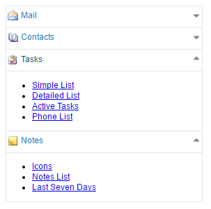
React NavigationBar

The NavigationBar for React is a vertical list of selectable items. When you select an item the content of the item is displayed either below or above the bar with the item. The component supports single or multiple expanded items. To switch between the two modes, you need to change the property 'expandMode'. By default, the NavigationBar can have only one expanded item (like Accordion). If the 'expandMode' property value is 'multiple', users can expand or collapse multiple items at the same time.
jQWidgets
  • Facebook
  • Twitter
  • Demo
  • Download
  • Documentation
  • License and Pricing
  • Services
  • Forums
  • About
  • Terms of Use
  • Privacy Policy
  • Contact Us

jQWidgets © 2011-2019. All Rights Reserved.