jQWidgets
  • Documentation
  • License and Pricing
  • Services
  • Community
    • Forums
    • Blogs
    • Follow Us
    • Client Login
  • About
    • About Us
    • Contact Us
    • FAQ
  • Demo
  • Download

React UI Components

  • Javascript/jQuery
  • Angular
  • Vue
  • React
  • Custom Elements
  • ASP .NET MVC
  • Showcase Demos
  • Responsive Design
  • Theme Builder
Show Demo List

React UI Components

  • jqxGrid
  • jqxTabs
  • jqxTextArea
  • jqxWindow
  • jqxKnob
  • jqxResponsivePanel
  • jqxChart
  • jqxMenu
  • jqxInput
  • jqxDocking
  • jqxGauge
  • jqxNavBar
  • jqxPivotGrid
  • jqxTree
  • jqxPasswordInput
  • jqxNotification
  • jqxBarGauge
  • jqxSortable
  • jqxScheduler
  • jqxNavigationBar
  • jqxMaskedInput
  • jqxPopOver
  • jqxExpander
  • jqxLoader
  • jqxTreeGrid
  • jqxListMenu
  • jqxComplexInput
  • jqxTooltip
  • jqxRating
  • jqxDraw
  • jqxDataTable
  • jqxToolBar
  • jqxFormattedInput
  • jqxColorPicker
  • jqxRangeSelector
  • jqxDragDrop
  • jqxTreeMap
  • jqxComboBox
  • jqxNumberInput
  • jqxScrollView
  • jqxSlider
  • jqxPanel
  • jqxEditor
  • jqxDropDownList
  • jqxDateTimeInput
  • jqxProgressBar
  • jqxScrollBar
  • jqxValidator
  • jqxRibbon
  • jqxListBox
  • jqxCalendar
  • jqxFileUpload
  • jqxSplitter
  • jqxValidator
  • jqxLayout
  • jqxButtons
  • jqxKanban
  • jqxBulletChart
  • jqxDockingLayout

jqxComboBox

  • Default Functionality
  • Multi Select
  • Settings
  • Categories
  • Binding to XML
  • Binding to JSON
  • Binding to Remote Data
  • Custom Rendering
  • Templates
  • DropDown Horizontal Alignment
  • DropDown Vertical Alignment
  • Cascading ComboBoxes
  • Checkboxes
  • Animation
  • Fluid Size
  • Events
  • Keyboard Navigation
  • Right to Left Layout
Theme:
Light
  • Demo
  • App.htm
  • App.js

Enterprise ready React Combobox component

React Combobox

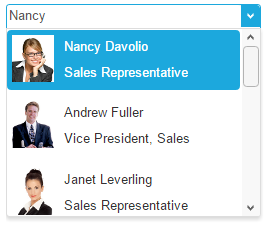
The ComboBox component for React represents a list of selectable items displayed in a drop-down. Information can be input in the text box and a specific item can be searched for. The component comes with built-in auto-complete and supports pictures and images. The Multi Select feature enables the selection of multiple values in the ComboBox. The component can be bound to Local Data, XML, JSON, CSV, TSV and remote data using JSONP. You can configure the vertical and the horizontal alignment. You can also have cascading ComboBoxes where the data of the second one depend on the selected item of the first.
jQWidgets
  • Facebook
  • Twitter
  • Demo
  • Download
  • Documentation
  • License and Pricing
  • Services
  • Forums
  • About
  • Terms of Use
  • Privacy Policy
  • Contact Us

jQWidgets © 2011-2019. All Rights Reserved.