jqxGauge Styling and Appearance
To set the jqxGauge's size, you need to use the 'width', 'height' and 'radius' properties. These properties accept percentage, number or pixel values.
$('#gauge').jqxGauge({ width: '20%', height: '30%', radius: '50%' });
The 'colorScheme' property allows you to change the jqxGauge's appearance. The possible values are from "scheme01", "scheme02" to "scheme11".
Ticks and labels
To put the jqxGauge's labels at the inner side of the tick marks, you need to set the 'position' property of the labels object.$('#gauge').jqxGauge({ labels: { position: 'inside' }});
or
$('#gauge').jqxGauge({ labels: { position: 'outside' }});
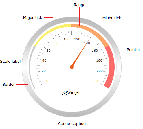
To change the position of the start and end scales, use the startAngle and endAngle properties. The default values are 30 and 270.
If the labels 'position' property is set to 'none', you can manually position the labels by setting a value to the 'distance' property.
First set labels position property to 'none':
$('#gauge').jqxGauge({ labels: { position: 'none' }});
The code example below sets the labels distance to be 5px from the gauge's bounds use the following code:
$('#gauge').jqxGauge({ labels: { distance: '5px' }});
The ticksDistance property specifies the distance of the tick marks from the gauge's bounds.
$('#gauge').jqxGauge({ ticksDistance: '15px' });
The labels CSS style is defined in the .jqx-gauge-label class which is part of the jqx.base.css.
Ranges and Caption
In order to display ranges in the jqxGauge, you need to set the 'ranges' property to an Array of ranges. Each range has startValue, endValue and specific style.var ranges = [{ startValue: 0, endValue: 55, style: { fill: '#C9C9C9', stroke: '#C9C9C9' }, endWidth: 5, startWidth: 1, startDistance: 10, endDistance: 10 }, { startValue: 55, endValue: 110, style: { fill: '#FCF06A', stroke: '#FCF06A' }, endWidth: 10, startWidth: 5, startDistance: 10, endDistance: 10 }, { startValue: 110, endValue: 165, style: { fill: '#FCA76A', stroke: '#FCA76A' }, endWidth: 15, startWidth: 10, startDistance: 10, endDistance: 10 }, { startValue: 165, endValue: 220, style: { fill: '#FC6A6A', stroke: '#FC6A6A' }, endWidth: 20, startWidth: 15, startDistance: 10, endDistance: 10 }];
The 'startWidth' and 'endWidth' properties of the ranges specify its size when the range begins and ends.
To hide the ranges, set the showRanges property to false.
$('#gauge').jqxGauge('showRanges', false);
To display a caption in the jqxGauge, you need to set the 'caption' property.
$('#gauge').jqxGauge({ caption: { value: 'jQWidgets', position: 'bottom', offset: [0, 10], visible: true }});
You can set value (text of the caption), position ('top', 'bottom', 'left' or 'right'), offset from the base position (array, the first element is the left offset the second one is the top offset) and the caption's visibility.
The '.jqx-gauge-caption' CSS class is applied to the jqxGauge's caption.
Cap and pointer
The cap is the small circle displayed over the base of the pointer.$('#gauge').jqxGauge({ cap: { size: '5%', style: { fill: '#ff0000', stroke: '#00ff00' } , visible: true }});
You can set its size, style and visibility.
$('#gauge').jqxGauge({ pointer: { pointerType: 'default', style: { fill: '#ff0000', stroke: '#ff0000' }, length: '80%', width: '3%', visible: true }});
jqxGauge's body, border and animation
To change the jqxGauge's border, you need to set its 'border' property. The 'border' property is an object with several members - 'style', 'visible', 'showGradient' and 'size'. The code example below defines a border with size equal to 11% of the Gauge's size. The stroke color is: "#898989".$('#gauge').jqxGauge({ border: { showGradient: true, size: '11%', style: { stroke: '#898989'}, visible: true }});
When the border's 'showGradient' property is true, the background will be with gradient. If you want to use solid color for the border set the 'showGradient' to false.
To change the background color or the stroke of your jqxGauge, use its 'style' property.
$('#gauge').jqxGauge({ style: { fill: '#cccccc', stroke: '#cccccc' }});
The duration of the value changing animation is specified by the 'animationDuration' property. The 'easing' property specifies the easing of the value changing animation. Possible values are: 'linear', 'easeOutBack', 'easeInQuad', 'easeInOutCirc', 'easeInOutSine'.
Working with jqxLinearGauge

To create a Linear Gauge with size set in percentages, use can use the following:
$('#gauge').jqxLinearGauge({ width: '20%', height: '30%' });
To change jqxLinearGauge's color scheme, use the 'colorScheme' property which accepts values from "scheme01", "scheme02" to "scheme11"
Ticks and labels
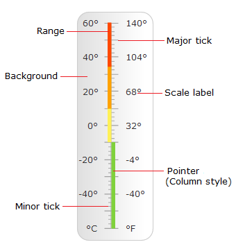
To customize the ticks displayed in the Linear Gauge, you can use the 'ticksMajor' and 'ticksMinor' properties.var ticksMajor = { size: '10%', interval: 5, style: { stroke: '#A1A1A1', 'stroke-width': 1 }, visible: true }
In the code above, we set the tick's size, frequency, style and visibility.
Tick's size can be set in percentage or pixels. If you want to change ticks appearance, you can use the 'style' property and set its 'stroke' and ''stroke-width' members.
For example:
$('#gauge').jqxLinearGauge({ ticksMajor: { style: { stroke: '#000000', 'stroke-width': 2 } } });
Ticks position is specified by the 'ticksPosition' property. The possible values are: 'far', 'near', 'both'.
For example, If you set the 'ticksPosition' to 'far', ticks will be displayed on the right side of the value indicator.
$('#gauge').jqxLinearGauge({ ticksPosition: 'near' });
To manually specify the ticks offset, use the 'ticksOffset' property. It is number and it sets the offset from the center of the gauge.
Customization of the labels could be achieved using the labels property. Here is it's default value:
var labels = { position: 'both', interval: 20, offset: 0, visible: true, formatValue: function (value, position) { return value; }};
The position property accepts the following values: 'far', 'near', 'both'. If it's 'near' labels will be visible in the left side of the scale. If it's value is 'far' labels will be visible in the right side of the scale. If the position property is with
value 'both' labels will be visible in both sides of the scale. Similar to this property is ticksPosition used for the ticks.
Let's consider the formatValue property. The formatValue is a callback function used for formating the value of a single label.
This function accepts two arguments - value and position. Value is the current label value. Position could be 'both', 'far' or 'near' depending on the value of the position property and the current iteration in the labels rendering.
Use jqxLinearGauge ranges
A single range is a colored area with specific size. To set jqxLinearGauge's ranges you can use the 'ranges' property. Here is a sample value for the ranges property:var ranges = [{ startValue: 20, endValue: 45, style: { fill: '#FFA200', stroke: '#FFA200' } }, { startValue: 45, endValue: 70, style: { fill: '#FF4800', stroke: '#FF4800' } }];
The style of a single range can be change by changing the value of it's style property.
You can set jqxLinearGauge's ranges by the following code:
$('#gauge').jqxLinearGauge({ ranges: [{ startValue: 20, endValue: 45, style: { fill: '#FFA200', stroke: '#FFA200' } },The startValue and endValue are indicating the end and the start of the range.{ startValue: 45, endValue: 70, style: { fill: '#FF4800', stroke: '#FF4800' } }] });
Pointer
The default value of the pointer of jqxLinearGauge is:var pointer = { pointerType: 'default', style: { fill: 'theme-specific-color', stroke: 'theme-specific-color' }, size: '7%', visible: true, offset: 0 };
The pointer of the gauge have two different shapes. The first one is a column and the second one is an arrow.
They could be switched using the pointerType property. For column pointer set the pointerType to 'default' for arrow set it to 'arrow'.
The code bellow will set the pointer type to arrow:
$('#gauge').jqxLinearGauge({ pointer: { pointerType: 'arrow' }});
The size of the pointer is setting through the size property which could be in percentage or in pixels.
Pointer's style (fill and stroke color for example) could be set via the style property. It's default value is based on the colorScheme.
Background and Animation
The 'background' property specifies the Linear Gauge's background fill, stroke and shape. It's default value is:{ showGradient: true, borderRadius: 15, style: { stroke: '#cccccc', fill: 'default-gradient'}, visible: true, backgroundType: 'roundedRectangle' }
Let's take a look at the different properties.
Background's fill and stroke could be set using the style property. It's default style is gradient colored in '#cccccc'. The gradient could be disabled using the showGradient property. By setting it to false a solid color will be used.
There are two built-in shapes for the background - rectangle and roundedRectangle. These different backgrounds could be switched using the backgroundType property.
Let's change it's value to 'rectangle':
$('#gauge').jqxLinearGauge('background', { style: { stroke: '#cccccc', fill: '#cccccc' }, backgroundType: 'rectangle' });
The upper code will change the background style to rectangle with stroke and background color '#cccccc'.
If you set the backgroundType property to 'roundedRectangle' you could set it's border radius using the borderRadius property.
You can hide jqxLinearGauge's background setting the visible property to false:
$('#gauge').jqxLinearGauge('background', { visible: false });
The duration of the value changing animation is specified by the 'animationDuration' property.
The 'easing' property specifies the easing of the value changing animation. Possible values are: 'linear', 'easeOutBack', 'easeInQuad', 'easeInOutCirc', 'easeInOutSine'.